PROUD SORNPAISARN
MEDIA COMPONENT 3
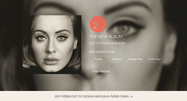
ANALYSING WEBPAGE ADELE
This is the first page that the audience sees when they enter Adele’s website. It is a promotion for her new album, 25, and allows her audience to pre-order the album right there, either through iTunes, Amazon, Google Play or on CD or vinyl. Towards the bottom of the screen, there is also a newsletter that will inform her followers of what is happening in terms of music, tour dates, etc. The design of this page is very minimalistic; the same picture is used for the background and the main ‘centerpiece’ of the page, and the overall colour scheme of this is very dull and almost sepia-like. This is contrasted with the logo of the album, which is a bright orange-y-peach colour, making it stand out of the whole page. The bottom tab is also a significantly lighter colour than everything else and would therefore catch the audience’s attention as well. In addition, there is a lot of emphasis placed on Adele’s face, hinting an air of intimacy that may be present in the album.

Clicking on the bottom tab brings the audience to this page. It is clear that in the background, it is still the same picture that is used but it is much more zoomed in to focus on the eyes and blurred out to give off a sense of anonymity, even though we still know that it is Adele. It is also extremely easy to gain a large following of the newsletter as it can be connected with Facebook, which the majority of people have an account with. The font used by the whole website is also very minimalistic and simple, unlike a lot of artists nowadays who like to experiment with different fonts and colours. The fact that there is a consistent font with a consistent colour and a consistent colour scheme makes the website incredibly appealing and aesthetically pleasing.

When the audience enters the website, they are greeted with the latest news from Adele, be it a new song, a new music video, or any radio or magazine interviews. The design, again, is very simplistic and the website utilises all the available space; most websites have a border around each post so it doesn’t look crowded but I feel like the use of all the space is very effective in that it stands out a lot more and captures the audience’s attention better. Each post on the home page is shown as a picture, from magazine covers to a photo of a conversation with another artist, and takes us to the post when we click on it. In this case, clicking on this would open the music video for Adele’s new song, Hello.
At the bottom of the page, there is a little message from Adele, which briefly goes over her life as a child and how she’s always wanted to grow up and be her own self. She also talks about her new album, 25, and how her life experiences have shaped the album in some sort of way. I really like the idea of a note from the artist as a part of the website as it creates a much more personal atmosphere and reinforces the sense of intimacy between Adele and the audience.
ANALYSING WEBPAGE SIA


This is the first page we would see after entering Sia's website. Because of her secure fan base, they would be able to constantly receive updates on concerts and the latest news by signing up to the newsletter. This is very convenient as it allows for direct marketing with a niche audience, which could potentially increase album sales. This enables the marketing fund to be better managed and adds more personal touch.
Clicking out of the pop up window would lead to this page. In the upper right corner of the page, the audience can follow Sia's Tumblr page. This picture is quirky and is unconventional in the fact that it seems like a truer reflection of her personality. This album therefore shows a different side to Sia that the audience has yet to see but still maintaining the same elements of herself that has made her famous i.e. her hair. This effect is reinforced through the font and draws the audience in to picking up the album.
Under the promotional picture, there is a music video of her new song, which makes it extremely easy to access. There are also links to purchase and download the song in addition to the various social media accounts that are used for fan interactions.
9 REASONS FOR WEBSITES
Build you own brand
Customize desiGn
Stand out in the crowd
Focus
Build fan base
Offline Marketing
No Commision
Endless Possibilities
Freedom
Use the design of the website to create branding of our artist, making them more recognisable online therefore products are more likely to be sold.
register for you own domain, eg. ww.ValentinaVow.com
The website only features our artist unlike shop sites like itunes that might have too much distractions and competitors therefore having our own website would bring the focus onto our artist.
It aids the effort of search engines, making it easier for people to find and consume out product.
Despite artist taking breaks, the products can still be sold online on our website.
By printing and putting the website link on the poster or a QR code on the poster, it also provides offline marketing opportunity.
Selling our own products on our website without any commision therefore we can generate more money for the next project.
You can keep on adding other webpage and links on the page to maximise the use of the webpage.
You have more freedom in marketing, if there are breaks products are still available online on the website.
ANALYSING WEBPAGE LORDE

Under the promotional picture, there is a music video of her new song, which makes it extremely easy to access. There are also links to purchase and download the song in addition to the various social media accounts that are used for fan interactions.
The originality and simplicity of Lorde's website design creatively and smartly linked its design to Lorde's album cover. They are both simple, clear and lack of Lorde's face eventhough she was a new artist. The ly out of the websit is extremely clear but very new as the navigation is not going across the page but rather down the page. Furthermore the music video is very easy to access which would easily increase the views in youtube.
CONVENTIONS OF A WEBSITE
1
2
3
Logo Placement
to help customers navigate through pages without getting lost and confused. Logo should be placed on the top left corner of the page.
Main Navigation
Should be plaed across the webpage for easy access.
Linking Style
Viewer should be able to tell what is linked and what is not.
4
5
6
Visual Heirachy
Everything that has texts have visual heirachy that is why it is neccessary for the viewer to know what is most important
STANDARD ICONS
provides clear explanation without words.
eg. 'F' logo as facebook
BUTTON FUNCTIONALITY
Viewer should be able to tell what is 'Clickable' and what is not.
7
Clear Naming
Viewers wants information first then creativity