PROUD SORNPAISARN
MEDIA COMPONENT 3
EVALUATION TWO

How did you integrate technologies – software, hardware and online – in this project?
EVALUATION SIX
How do your products represent social groups or issues?
How do your products use or challenge conventions?
EVALUATION one
ARTIST'S WEBSITE
ARTIST'S DIGIPAK
WIX
GOOGLE DOCUMENT
WIKEPEDIA
dafont
PHOTOSHOP
ILLUSTRATOR
MAC BOOK
CAMERA
SCANNER
HARDWARE

ONLINE

SOFTWARE

We researched using established artist's website and digipak as they convey a strong sense of star persona and they also use a consistent font and colour throughout the website and the digipak. Prior creating the website we have taken some stills from shooting the music video, therefore we intended to incorporate those stills into the website. Furthermore I have looked into different website designing sites, the free online website creator are very rare and wix has the most functions and most user friendly therefore I decided to go with wix. I created Valentina Vow's
google adress to be able to use a clear html. To be able to choose the best font that we wold use consistently throughout the website and the
digipak we tried finding a font that screams Valentina Vow in 'DaFont' but we could not find one until we looked into wix's font and
found 'DRIOD SERIF' for the album title and 'EB Geramond' for Valentina's name. Because our artist have been on the cover of Seventeen
Thailand Magazine we used the scanner to scan the cover through into my computer to be able to insert the file into her 'About V' page. Photos of Valentina V are adjusted in photoshop to maximise her beauty. Moreover for our store, we drew our products in Illustrator before exporting it to JPEG. and upload it onto wix.

Her name as a logo on the top left 'Navi' bar.

Her name in the middle of the page.
No Logo

Her name is on top of the navigation box.

It covers the whole page.
Yes!
No, it goes vertically.
No, it goes vertically.
LOGO PLACEMENT ON THE UPPER LEFT OF THE PAGE
MAIN NAVIGATION SHOULD APPEAR ACROSS YOUR SITE
LINK STYLING: WHAT'S CLICKABLE AND WHAT'S NOT

As the mouse hovers over the button it makes the other buttons smaller and more transparent
The button changes colour when hovered above.

The button changes colour when hovered above.
The cursor changes to a hand pointing when the cursor is hovering above what is clickable
BUTTON FUNCTIONALITY
✓
✓
✓
✓
STANDARD ICONS
Uses words rather than icons.

Uses icons of social media sites and music purchasing sites.

uses the icon and also other social media sites
Uses social media logos
VISION HIERARCHY

1. Album purchase 2. Join Adele via Facebook 3. Music Video 4. Personal page
1. Sign up to Sia's special offers 2. Album Purchase 3. Music Video 4. Connect with Sia

1. Music Video 2. Album Purchase 3. Song Purchase 4. Official Store

1. Sign up to be a 'Vower' 2. Music Video 3. Album Purchase 4. Song Purchase
CLEAR NAMING
adele.com
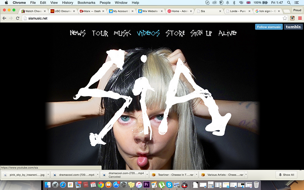
siamusic.net
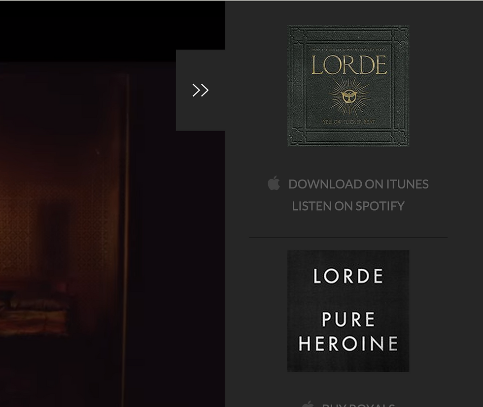
lorde.co.uk

http://valentinavow.wix.com/valentinavow
To conclude our website does follow it's convention althought not exactly the same to make it more original which would represent our star. It has clear navigation and distinctive colour 'white marble' which conveys mysteriousness with its pattern and innocence in its colour, representing our star. Additionally the colour gold which suggests glamour and high status which represents our target audience.
Rather than comparing our artist to other contemporary artists, I think that the website is more about the star persona the company wanted to create. How the company plans to market the artist in order to appeal to their target audience therefore I am comparing our website to Adele, Sia and Lorde's; since they all have similar star persona we wanted to create for our artist. Adele's deep mature voice, Sia's faceless debut and Lorde's faceless digipak design.