PROUD SORNPAISARN
MEDIA COMPONENT 3


EVALUATION one

EVALUATION TWO
How do your products use or challenge conventions?
How do your products represent social groups or issues?
How do the elements of your production work together to create a sense of ‘branding’?
EVALUATIONTHREE
How do your products engage with the audience?
EVALUATION FOUR
EVALUATION FIVE
How would your work be distributed as real media products?
EVALUATION SIX
How did you integrate technologies – software, hardware and online – in this project?
YOUTUBE
WIX
GOOGLE DOCUMENT
WIKEPEDIA
ONLINE

PREMIERE PRO
AFTER EFFECTS
PHOTOSHOP
YOUTUBE DOWNLOADER (YTD)
SOFTWARE

MAC BOOK
CAMERA
TRIPOD
MICROPHONE
LIGHTS
HARDWARE

In the planning stage we used mostly online resources such as watching contemporary country artist's music videos and researching more in depth of the sub genre. Further more I used wix to display my findings and researches. Because we worked as a team, research projects are done on google document so everyone in the group has an input. prior filming sessions we also wrote risk assessments, filming schedule, location
survey and story board on paper. This is later applied to the production sight where we used mainly hardwares such as camera to film, and
tripod for static shots and panning shots. Microphone that is attached to the camera for further uses in making 'behind the scenes'for
the artist's intimate moments. We also used professional lighting to film our artist for the best out come of the picture, however in the
middle of filming the fuse burnt out therefore we can only use the light for a certain part of filming. WE transfered the files from the
camera via SD card and CF card (along with the CF converter) into my macbook ready to be edited on premiere pro. Effects such as green
screen is done on after effects and photoshop. The song is downloaded via Youtube Downloader (YTD) and then uploaded once again onto
youtube when the product is finalised.
The first shot of rose petals falling conveys dying love as well as ambiguity, it is overlapped by three different scenarios further emphasizing ambiguity as well as creating a dreamlike image. The first overlap is an extreme close up shot of red chips that represents the artist’s love, the second shot is a mid-shot of a female placing her hand against the large city scape this conveys loneliness as well as the feeling of yearning for someone, then the petals falling shot fades away as the artist’s close up head shot emerges, although surrounded by flowers the artist’s facial expression is gloomy which suggests that she is scarred by love and that the thought of love hurts her. The close up shot of the artist’s face half covered with card shows that she is hiding herself from her opponent, however as the camera pans down tracking her movement as she place one of her cards down showing that is she slowly falling and slowly revealing her feelings to her lover. However there was a cut before we could see the cards on the table, back to the artist’s headshot lip-syncing ‘blew me away’ with a sad facial expression which suggests that the artist regrets that she opened her heart to her ex lover and does not want to think about it, this shot also foreshadows the guy leaving her at the end.
‘When you took my sorrow and you took my pain’ was accompanied by the shot of the guy taking her cards away symbolizes that he accepts her heart and also accepts her flaws, sorrows and pain this shot then changes its focus to the foreground which is the rose on the right hand corner showing that their love blossomed from then on. The editing after this shot is mostly fades between different scenes which symbolises that the time she spent with him was dreamlike. Moreover the montage of the bed scene, skyline scene and the cards scene creates a collection of her memory when she thinks of ‘him’.
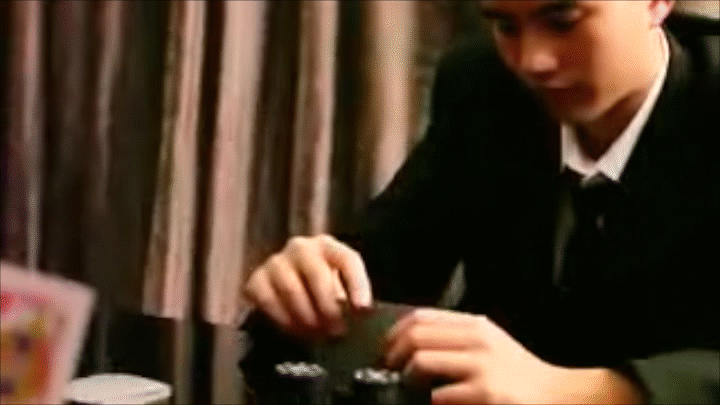
After the blossoming love the scene where the guy is shuffling the cards shows that he is controlling this game of love this shot is further emphasized in the fingering of the guitar as the guy also controls the song and rhythm showing that he is the upper hand of the relationship. However even though there are scenes that suggests and foreshadows him leaving the edits are still fades because the protagonist does not realize that he is going to leave as stated in the lyrics ‘watch you wave, watch you wave’. Although she have seen everything she still believed that it was love.
Although most scene transitions are fades the scene transition to and from the lip-sync scenes are cuts since it shows that it is a reality, the lip-syncing scene is the artist telling the audience a story as the lyric goes ‘This is how the story went’. These lip-syncing shot conveys loneliness in the composition: the artist is placed on the left side of the shot looking out to the big city, showing the empty space that used to be filled. This shot is handheld connoting her unsettling mind filled with anger, resentment, loneliness and love; this handheld shot during the lip-sync scene is also used in Avril Lavigne’s ‘When You’re Gone’ conveying sadness and unsettling mind.
The extreme close-up shot of the artist’s eyes conveys sadness as accompanied by the lyrics ‘Wake up to your face’; this suggests that the reality is not what she have hoped for, she wished he could be by her side but when she opens her eyes to reality he is no longer there. The shot of the pillow puffing up symbolises emptiness is then faded into the two shot of the lover’s silhouette which symbolizes the love they used to have, this is in contrast of the skyline lip-sync scene because the two shot is filled with people, filled with love whilst the lip-sync shot is mostly empty. The lip-syncing scene then has a night sky as the background showing that she waited for him day and night, with the city lights symbolizing her flickering light of hope that one day he will return. This light of hope is then blown away by the extreme close up shot of the guy’s face as he lies on the bed and grinned but then he leaves as the song goes ‘disappear one day’; foreshadowing that he is going to disappear. Furthermore the shot where the focus changes to the hand further away also symbolizes that he is going to leave her. This is further emphasized by the next close up shot of the heart suite card that is being covered by another card showing that in this relationship other factors have won over love that is why the relationship have ended. In addition it also shows that the female changed her perception of love because of him.
As the song goes ‘Morning rain, morning rain’ the close up shot of the rose’s reflection in the water represents the artist reflecting upon her love and herself. As the shot pans up to her hands and she tightens her grip then let the rose goes shows that she is going to let her love go, that she is going to live on without him. This is then cut to the static shot of a picture frame on a cupboard with the artist’s lip-syncing scene with her lover within the frame. This conveys her love and memories of him is all encapsulated in the picture. The colourful life he painted her is no longer to be seen, the only color in her life is him. However when she flips over the picture frame it further emphasizes that she is letting go of him and she can spend her whole life hiding her heart away. She has to live on without him.
ROMANTIC (idealised) RELATIONSHIP
GENDER
MENTAL HEALTH
RISK & REWARDS OF LOVE
REALITY vs MEMORY vs DREAMS


Our product engages with the audience becasue our artist's voice is deep and filled with sentiments which could indicate that she is experienced in life therefore has the ability to create relatable songs. Classy and minimalistic designs for both the digipak and website consiting of white marble and gold fonts would suite our target audience's tastes ( teenage to middle aged high class female), the later target audience might have difficulties using new technology therefore our website design makes it very simple to navigate around and to become a member. The music video is grainy as it brings back nostalgic feelings similar to what have been conveyed in Taylor Swift's vintage polariod digipak.
KEY APPEALING ELEMENTS
simplicity
class
meaning
relatable
.
.
.
"Buckingham believes it is essential to situate young people’s media use within the context of their other social activities and experiences due to the fact that many young people are using the media as a wallpaper: a wall of noise to fill up ‘down time’ or just to pass the time due to boredom. That many of their interactions with the media are not contrived, committed or concentrated but fleeting, visceral and meaningless."
FOCUSED AUDIENCE
They are more focused on deep meaning, complex narrative and use of signs which suites our music video which has many symbolisms such as cards and token representing love (based on psychology's 'equity theory' and 'social exchange theory') and control within a relationship. This is further emphasised by the close up shot of a guy's hand strumming the guitar once again conveying control over his partner. We also used city lights to symbolise loneliness and singing out to the city line showing that thing song is meant for someone to be heard. This can also be applied to our original digipak design that could not be printed: reflective paper that acts like a mirror which represents how each and every song in this album is for self reflection and relatable, the song is aimed for everyone to see themselves in it. Moreover the marble design that we changed to be able to print out is also representative of the star persona we wanted to create which is mysterious yet innocent. We chose white marble to encapsulate this image as the white colour represents innocence which suites with her age and face whilst the marbling patterns like smoke represents mysteriousness which conveys her deep voice; we applied these colours to both our digipak and our website to create a 'branding' and convey a similar message to the consumer. Especially the focused audience would enjoy cracking down the representations and symbolisms in our designs. In addition the complex narrative that our music video provide is the plot twist in the end that the fault does not solely lie on the guy but might also be her fault, which is representative of the sophisticated reason behind any relationship breakdowns, it is both of the partner's fault just as the bible says ""Why do you look at the speck of sawdust in your brother's eye and pay no attention to the plank in your own eye?", is the message we wanted to give out to the audience of this music video.
GLANCING AUDIENCE
Glancing audiences are interested in open ended narrative, quick editing and focuses on the performance. Our music video is indeed very open ended as it is edited in a dream-like, distorted memory that has no specific narrative and storyline. The performance shots are extremely beautiful such as tight head shot surrounded by flowers and the city scape. The glancing audience can be explained again for our original digipak design using reflective paper, as it captures attention in the store since it refelcts and therefore would stand out from the rest of the digipaks. This is also applied to the white marble design as it's simplistic design can make it stand out from the vivid and busy digipak covers, moreover it is aestethically beautiful; which applies similarily to the website.
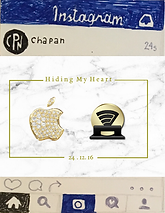
First Launch
31.10.16
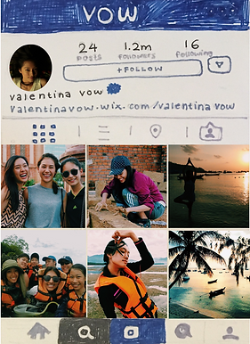
The first launch will be a hint on the company's social media, since our artist's initial is double V which looks like fangs. The post consists of the artist's colour white and gold. This sets the first launch in promoting our artist. It also fits in with the mysterious persona we wanted to create for her.
1.11.16
The next day after the launch the company will publicise that there will be a new artist debuting as a christmas eve present to the audiences. At the end of the press the company makes a 'V' pose to the camera which means Valentina Vow.
6.11.16
TO create a stronger fan base for our artist we wanted to give hints using established actors and singers to promote hashtagging '#ivow...' starting from emma stone's birthday. After this post hopefully the # would become viral promoting valentina vow's name
7.11.16
CHapan would then promote this further to give out two free vouchers to the cafe 'hands in heart' to the three person who's vows matches valentina's. this leads to the next clue which is 'white marble' because the cafe is decorated mostly white marbles, and will be the first venue valentina will perform. This post will also reveal valentina's logo. Moreover the three winners would also hint more about valentina's personality.
#iVow...
14.11.16


Vouchers will be given by the deadline of a week to generate a buzz in the online community we kept the deadline short so people won't get bored. these are the pictures of 'hands in heart' cafe, which is extremely similar to our digipak and website design integrating white and marble to create a simplistic interior. this cafe also specialises in selling exotic coffee which is best when listening to valentina's songs.
THe three winners are:
'#ivowtokeepmytanskin'
'#ivowtowritemoresongs'
'#ivowtosmilemore'
which would then be reposted by chapan's social media.
15.11.16


We use only two main colours in all our products which is white and gold. The artist's name and logo would always be in gold whilst the album cover and name is in white. The music video is the title track of the album which has a warm tone to it, however in the end we linked it back to the bedroom scene where she was alone and all of the music video was her memories that triggered through the picture, moreover conveying the loneliness and colourless life she lives without love the tone in this scene is white, which links perfectly with our digipak and website. Not only does our products have similar colour schemes we also kept the fonts consistent therefore making it easier for the audience to recognise our branding.
In addition to the similar font and colour we also created branding by advertising the album release date at the end of the music video. Therefore our consumer could easily be aware of other products we provide. Whilst the customer is consuming one product they are also increasing their awareness of other products.
The white marble was chosen for it's timelessness as it is found in Roman times and are still being used to decorate many high class cafes and restaurants. Our artist's song is also timeless as it does not conform with the trend nor go against it, it is timeless. Moreover the link between white marble with our title track 'Hiding My Heart' is the formation of the marble which has go to through immense pressures in order to form. Which is similar to the song hiding my heart as the protagonist have been shaped by the pressure of partner retention which shapes her into the person she becomes and the songs that she writes. Furthermore the colour white which represents the innocence of our young artist whilst the mysterious patterns on the marble shows that within the innocent presence it is also scarred with experiences and emotions.
16.11.16

17.11.16
#iVowtokeepmytanskin
#iVowtowritemoresongs

#iVowtosmilemore
18.11.16

#iamVow
19.11.16 - 27.11.16
Although we have already posted a picture of Valentina Vow, the audience still does not know her name therefore, CHAPAN will set up a guessing game for her name.
Everyday a letter will be posted on social media in reverse order (in terms of letter) of her name. The rewards (limited to 20 person each) will decrease as more letters revealed. The top reward is to attend CHAPAN's company party which has established artists and Valentina Vow attending.
This is the design for each letter's post

V
a
l
1.12.16

DECEMBER SHOOT
#iVowtokeepwarm
2.12.16

Valentina to be on the cover of SEVENTEEN magazine in order to advertise herself as a teenager who has a deep and sentimental voice.
11.12.16
it is very important in terms of marketing to update regularily especially celebrating festive periods. which would make more peopl interested and have a loyal fan base.
after all the promotions chapan has made for valentina it is now her turn to charm her fanclub with her personality. her social media shows the student side of her making it easier for the audeince to relate to and to adore her. moreover in all of her social media there will be a link to the official website to expose it to her fans.
10.12.16


12.12.16
For the album's title track the fanclubs will be playing hang man on live stream with valentina via youtube. This post is to make the fanclubs aware of the live stream game. A two way communication makes the fans feel speacial therefore create a stronger fanbase

Right after having the correct answer on the live stream hangman game with the fans the title track is then revealed.
16.12.16
19.12.16
20.12.16
21.12.16
22.12.16
Because Valentina Vow is a singer-songwriter to promote her ability to write and compose songs, established artists who has unique styles comes together to count down by covering her chorus everyday until her song comes out.

A rap and electro cover of 'Hiding My Heart'.

Make a pop ballad of 'Hiding My Heart'

Make an acoustic cover of 'Hiding My Heart'

Ending with Queen B maybe doing a groovy dance song to cover 'Hiding My Heart'
23.12.16
Teaser Release
Music Video & Website Release

25.12.16
Digipak Release
24.12.16
Since our world now evolves around the interne: many goods are more commonly purchased online since it is more convenient.
for our music video and the title track will be sold through spotify and itunes. Due to the growing numbers of apple users where our target audience lies within he apple users it is easier to reach out to them. Spotify is also very popular amongst teenagers.

Because our sonG is mainstream we wanted to upload our music video on youtube rather than vimeo as it appeals to a wider audience and it is where the mass consumes music and entertainment.
Digipak will be released around the world in high-end shopping malls such as in Thailand: Cntral Wolrd, Central Embassy, Paragon, Emporium, Emquartier. And in stationary shps located in those shopping malls because we are aiming at teenage girls therefore the stationary shop would be convenient for them.

shopping mall that provides us with new shopping experiences, many teenagers can be found here every single day.

The high-end shopping mall filled with most expensive shops. Many high class females would be seen shopping in this place.

The largest shopping mall in Asia.
shopping mall that provides us with new shopping experiences, many teenagers can be found here every single day.
WE wanted to sell a hard copy of the digipak for valentina's fans as they could cherish this prized possession. our design makes it timeless and classic for the fans to buy and keep as a representative of valentina vow. we could also attach photo cards of valentina vow in the album to make it even more personalized to the fans.

The music video mostly contains warm colour palette as it represents how the protagonist is blinded by love. At the end it pulls the audience back to reality where she longer has no one besides her and now it is colourless and bland just like the album cover and the website as she is left with a white room and the thoughts of him that fills her mind. At the end we also advertise the digipak with the release date making those watching the music video aware of the digipak as well.


