PROUD SORNPAISARN
MEDIA COMPONENT 3
WEBSITE CREATION
CHANGE
LOGO DESIGN
CHANGE ONCE AGAINLORDE
CHANGE IN LOGO DESIGN
COLOUR SCHEME
 Grey Text & Black BackgroundThe grey text and black background gave off a very rock music or some very antique music which does not suite our theme of loss in love and our glamorous concept. |  Gold Text & Black BackgroundDespite the black that blends very well with our video and the gold that suits our glamorous concept, it does not encapsulate the album as a whole as it only focuses on 'Hiding My Heart' which is just one track of the whole album. |  Gold Text & White BackgroundGold suites the glamorous concept however it does not suite the album cover. |  Grey Text & White BackgroundThis colour scheme fits best with the album cover and the title track's ending, as our album is focusing on taking the listener inside her mind as seen from the repeated nature of the song that is sentimentally pulling the audience into Valentina's mind. |
|---|
ADDITIONAL PAGE
We decided to add another page, "About Me", for the fans to get to know our new artist, although she is presented as aloof and mysterious. Thinking on the fanclub's shoes, they would like to get to know more about the artist to be able to create a stronger fanbase that would really grow attached to her as a person. In terms of business we could turn the fan clubs into regular customers as they grew emotionally attached to the artist. "About Me" page would contain a hand written essay of her life assosiated personally with the title track "Hiding My Heart", which would make it more personal to the fans. Moreover we were planning that we might be doing a reality show or variety show to make the fanclubs fall for Valentina's charms as it is her first debut, the compnay has to introduce her to the public so she can create a wider fanbase.

After creating the home page, it looks more like a electronic and dance genre rather than contemporary country. Although we do have some scenes of the skyline within the music video but the colour has been changed to a warmer tone therefore it does not have any coherence with the music video nor the digipak. It does look professional however it does not communicate and encapsulate our artist nor the title track, therefore we decided to change the design and colour scheme. This new design focuses on the head shot which is filled with roses and gives an organic vibe. The website complements very well with the picture as the picture blends into lack and it gives off a mysterious, feminine vibe that is intriguing and interesting which is how we wanted to portray our artist. We have also changed the name of our artist from Tia to Valentina Vow. The reason being that Tia sounds more masculine and cool rather than feminine and mysterious, therefore we felt like Valentina Vow is a more suitable name to call our artist.


We tried two different fonts for our artist's icon. We felt like the second one was a bit too plain and generic for our artist. The first one, however, we drew inspiration from the bandEvanescence, since their style is somewhat similar to ours and so it is likely that we will go with the first one.
This is the first design that we have in mind, however the sharp points made it looked very fantasy and vampiresque in addition to the background that has black and red therefore it has intertextuality with Evanescence. We thought that the vampiresque theme as it seems more metal or rock whilst our music is contemporary country. Therefore we tried to make the 'V' less pointy so that it does not represent vampire fangs so we had this second design.
After making the 'V' less pointy we thought that the design does not look that appealing anymore therfore we decided to go with the first one however we are still contemplating about whether we would use this design because it does not reflect how we wanted to portray our artist as mysterious and classy.
We've decided to base our website off of Lorde's website. It is very unconventional in the sense that the music video for her new song, Yellow Flicker Beat, is the main thing on the page. Other than that, there is a sidebar where we can scroll through but it is only the promotion of her album, signing up for a newsletter and her social media accounts. I feel like, this way, since there is not much information on tour dates, new releases, etc., more of her fans will be inclined to sign up for the newsletter in hopes of getting more information about her music. Lorde also has a Spotify follow button at the bottom, which is quite uncommon for artists to do.
There is also an obvious lack of Lorde's face, which is weird in that she is a new and upcoming artist but she doesn't show the world her face. This may be used to create an air of mystery and reinforces the audience's inclination to sign up for the newsletter.


When we click on the OFFICIAL STORE link on the sidebar, it brings us to a merchandise store, where it sells T-shirts, sweaters, jumpers and music. The layout and colour scheme of this page is a lot different from Lorde's website, which may be mainly due to the fact that it is on a different website but I feel like we can use this to tie in our music video and website to the digipak since our digipak is going to be mainly white.

We've designed our album cover so that the artist's face is not on the front. While we understand that this challenges the conventions of new artists, we believe that it would work better with the music video and the website. We also found that Lorde's first album, Pure Heroine, was as simple as her name and the album name on the cover so we are planning on taking what she has done and applying it to our own digipak.
INSPIRATIONS
We thought that the design above looks too much like a rock music artist's website therefore we thought we should use the same inspiration as the inspiration for the digipak design which is Lorde who have bravely went against the conventions of a newly debuted artist and has gained a lot of attention since. Therefore after looking at Lorde's website we thought that the concept and the layout is extremely simple yet intriguing and mysterious we then applied the structure to our website.

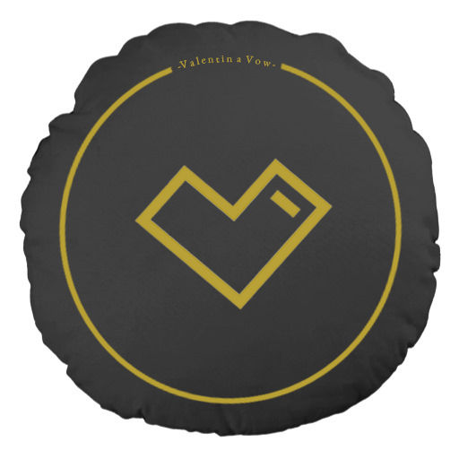
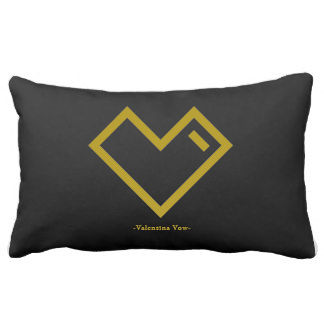
At first we wanted a diamond because of her voice that is like diamond, unbreakable yet a bright and innocent face. Moreover the diamond is created by only her initial 'V'. However we found that it is not memorable enough and it looks too manly to represent our star and capture our target audience's attention as it is extremely simple and cliché.
Therefore we ended up with this logo as it is similar to our artist's initial a 'V' and it also represents a heart that shows how she sings sentimentally and also a heart to fans that she is always thankful for. This shape is very eye catching and memorable. We feel like this logo encapsulates Valentina Vow as a singer and a persona who loves her fans and sings from the heart.
ALBUM PURCHASE PAGE
SINGLE PURCHASE PAGE
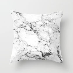
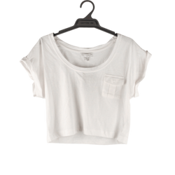
These are the products that we want to put on to the merchandise page. Because our target audience is a high class female teenager and high class working women. We then put ourselves in their shoes and think of what we would want. We decided that these merchandises would be most wanted amongs our target audience. We have interviewed people who we would regard as our target audience and decided to go upon the majority decision which are; crop top, iphone case, necklace, pillow and water bottle.
MERCHANDISE DECISIONS

MERCHANDISE DESIGNS
MERCHANDISE FINAL PRODUCTS
 |  |  |  |
|---|---|---|---|
 |  |  |  |
 |  |  |  |
 |  |  |  |
 |  |  |  |
 |
HOME PAGE CHANGE
The last design was too dull consisting of white and grey colour which does not really capture Valentina Vow's persona nor would it capture our target audience's attention therefore I have decided to change the background of the webpage as well as the font and colour of the texts to make the home page more cativating and glamorous to suite and sastisfy our target audience.


We also added a fanclub subscription to make promotions to our regular customers easier. This makes it easier to create a loyal fan abase and to ensure that our products are being aware of. It also enables estimation of the amount of products we want to produce.