PROUD SORNPAISARN
MEDIA COMPONENT 3
 |  |
|---|
BEHIND THE SCENES
On Sunday the 11th, I went to Tan's house our first location for the Music Video. I packed lights, camera. laptop and tripods to her house. First of we started with the cutaways such as rose petals and falling cards. We spent around an hour setting up the scene before our actors arrive. We started off with the mirror lip sync scene; therefore we manually destroy the mirror into pieces and carefully laid them down on the floor along with arranging the actors in the shot. After we are done we moved to the cards playing scene. Unfortunately it was 8pm and we have to hurriedly film the actress's lip syncing scene due to the time constraint.
FONT RESEARCH


For the font that we're planning to use in our music video (as the title) and possibly on the digipack itself, we drew inspiration from Adele's album, 21, which we felt like had a minimalistic yet impactful look.
I found out that the font used on Adele's album, Avant Garde Gothic Extra Light, was not available to download for free, so for our music video, we tried out different fonts and ended up using Apple Braille. We put the whole title in capital letters and put an extra space in between each letter to make the title seem a bit more spread out, as well as putting a box around the letters because without it, it seemed like there was too much empty space so this is what we ended up with.
ROUGH CUT
PEER FEEDBACK
PERSONAL FEEDBACK
 +: creativity scenic good lighting suites the mood and rhythm of the song but POKER! -: quality of video add more transition shaky to improve: use of tripod try using movement of camera into a new segment |  +: Lip-syncing, ling down Scenic view, good shots + beautiful Very appropriate to the genre Goos lip-syncing Good use of scene shots to suit the music -: The different scenes where Numtip's lip syncing Good use of camera focusing and zooms out to improve: The cards - a lot of card scenes |  +: Everything go together very well Fits perfectly with the genre smooth and slow -: Poker could be emphasis to improve: Play around with edits or try colour grading to set the mood |
|---|---|---|
 +: Good Quality Shots Colour Effects Compositions: rule of thirds Close ups Good ideas Very appropriate to the genre -: Flower part - too repetitive to improve: More Cuts? |  +: Beautifully framed and compose opening shot. Interesting imaginary - mirror, flower, cards, chips Tone of presentation and performance fit good performance. -: Composition of the guitar and performer face is 'odd'. Zoom in face -grainy. Feels fragmented - each cut to a new set-up seems to be from a different music video (card game, cityscape, headshot, guitar). To improve: Need to solve the problem of how make all the elements together -opening scene -headshot background |  +: Really abstract, beautiful shots Love the close up and the slower scenes Really smooth Composition Very appropriate to the genre of the music -: Maybe more cuts and add more scenes Too much slower scene to improve: Maybe film more scenes to replace some of the flower scenes |
How do you feel about the rough cut?
What needs to be done before the final deadline?
How do you feel about the process so far?
Lets start with the successes of the process, at first i was scared it would all fail; however, it haven't and the scene i love the most the head shot scene worked just as how i imagined. On the other hand the rough cut lacks coherency, it looks like sections of different music videos joint together. I regret rushing through the planning process and have not studied this music video thorough enough. One of the key parts of a music video is it's coherency. i feel like we have a lot more thinking and executing to do in order to make a 'decent' music video.
i love the start of the rough cut until the end of the first cut of the head shot. Other shots after that looks like a mess, it feels fragmented. The head shot worked very well with the song however we need to improve how we link different shots together to make the music video as one.
we have to have another meeting with everyone in the group to discuss how we would like to glur the fragmented parts together. We need to film two to three more scenes if necessary, if we do need to film once again then it would be a good opportunity to take more photoes for the digipak and the website.
EDITING DIARY
 Fuji ETERNA 250D Kodak 2395 (100%) |  Fuji ETERNA 250D Kodak 2395 (33%) |  Fuji ETERNA 250D Fuji 3510 (33%) |
|---|---|---|
 First Title |  Title |  Movement |
EDITING DIARY 2.11.15
 |  |  |  |
|---|
EDITING DIARY IN RESPONSE TO ROUGH CUT FEEDBACK
In our music video, there are all together three themes; rose petals which gives an organic feeling, building which gives a cool tone and playing card which is grand. These three themes in the music video were fragmented as if different parts of the music video are embedded into one. The music video that I think links most with our work is Taylor Swift's 'Safe and Sound' which takes you indoors and outdoors to every scenes that will be used in the music video, furthermore alternating between cool and warm tones. Since our song also starts with the guitar melody which inspires me to cut with the gchange of guitar intonation. And more so these music videos has guided me to a solution as to linking different scenes together. As I observed many music videos that has different themes and scenes they are mostly linked together with the first 20 seconds of the song as the music video director takes the audience everywhere with him for the audience to expect the changing scenes in the song. In response to the feedback along with the additional research in linking different scenes together have inspired me to create three versions of the opening.
The first one is the one in the rough cut which did not work very well with other scenes as it only shows the organic theme of the mudsic video. Therefore I came up with the second one to expose the audience with different scenes in the music video within the first 20 seconds of the song to make it more coherent however I feel that for this song it is not suitable for fast cutting pace eventhough using fades it does not fit in with this very slow and subtle song. Therefore I came up with another idea to overlap the rose petal withh different scenes and instead of using cuts I choose fade instead as it is more fitting to slow songs. To make the overlap clearly I have to adjust the levels of colour to make the black more black and the red more red. There are still some flaws in thelast one but it is the one I think works best therefore I will adjust the matching of petals falling to the beat like the first one and hopefully this opening will tie in everything together.
EDITING DIARY LESSON IN WARP STABILIZER
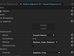
As you can see from the clips above, there is a problem in stabilizing the shots, despite nesting those shots the red notification does not cease to appear so I have done some further research on 'Warp Stabilization'. I have seen two tutorials and instead of nesting they have created a new project in Premier to stabilize their videos. Furthermore the tutorial on the left also solves my problem of the shots being warped as if it was shot through water, he recommeneds that we change the shot to 'Position' instead of 'Sub Space Warp'. Moreover that I should keep the 'smooth motion' because the camera is actuallt moving. however it the camera is not moving it should be 'no motion' so we can get a static shot.
This is a comparison between 'Sub Space Warp' and 'Position', as you can see the sub space warp makes a jelly effect on the shot and the position makes it smoother and more realistic.
EDITING DIARY WHY FADE?
We decided to use a lot of fading between each of the shots. In the first screen shot, the overlapping of differing props i.e. the roses and tokens suggests that no matter how insignificant or how irrelevant it seems to be, her thoughts will always come back to him and all the memories associated with him will flash around in her mind. Although they occur at different places at different times, there seems to be a blurring of memories, as if everything happened all at once, which may work together to make the heart break even more painful. As for the second screenshot, we can see the silhouette of the guy fade out as the lip-sync part fades in. The guy is strategically places almost "on top" of the next shot, which suggests that she is still thinking of him and the times that she's had with him, since the first shot is silhouettes of the guy and the girl talking, and enjoying each other's company. This also signifies that she is reminiscing the time when she was still with the guy and could open her heart up to him. The fading also goes in time with the tempo of the song and therefore is suitable to include in our music video.


EDITING DIARY CHANGE!
A road without a destination, is what I would describe my music video right now. We seem to have a narrative that is on going, a naarative that has no definitive end, not drawing in the audience's emotions. After listening to the part of the song that we have left I visualised a girl on a white bed and waking up with a continuity cut to her rising above a white bath tub filled with rose petals, this symbolises the break through of her sweet dreams and memories that she now realises that it rather bitter than all sweet. Moreover since I have used many fades it is dreamlike, therefore the ending shot I thought of a twist; the girl has been traumatised by her love (based on 'going back to where I started, morning rain, morning rain' suggests to me that she has depression, the guy came in like a drug that made her good for a short amount of time but when he left, she was left with a larger scar) she is diagnosed with depression and is in a white room sitting on a bed staring at the picture frame of her and him, and all the music video from the start is her hallucination from the picture, as it zooms out she smashes the frame down as the same time as the last line of the song 'I can spend my whole life hiding my heart away.'
SHOT COMPOSITION


This shot is inspired by 'The Fault in our Stars' the picture shows affection as well as forshadowing the sense of loss. Moreover our music video conveys the same sense of loss and lonliness of the singer as her lover leaves which is similar to the movie as they were seperated by the word 'death' whilst the seperation of 'Hiding My Heart', was seperated by an unknown reason which opens up to interpretation of the listener. Therefore we compile different symbolism shots to trigger the audience's imagination as to why her lover leaves. Furthermore we would like to avoid giving audience the difenate answer since we would like the audience to approach each shot with their own story. Therefore each person would convey different stories out of the music video.
COLOUR SCHEME
EDITING DIARY AFTER EFFECTS


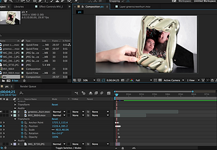
We green screened the picture frame to insert the singer lipsyncing the song. This shot also conveys how the artist is singing and reminiscing her memories created with her beloved one, however it is time for her to move on no matter how much she loves him they cannot be together. I used "Key Lighting 1.2" with screen gain at 75. I also have to mask the shot as we can still see parts of the shot outside of the frame. Although we tried to shoot it as stable as we possibly can with a tridpod there are still some minor movements in the shot therefore I used "Track Motion" to the the frame's movement and applied it to the smaller shot to make it move along with the frame, however there are some minor problems since the anchor key is off point thereofore I have to then manually adjust the anchor point to make the shot fit the frame.
BEHIND THE SCENES P R O D U C T I O N
IMPROVEMENTS NEEDED
"The actual editing of the scene I review my first assembly of a scene, more often than not I can still vividly (too vividly!) recall making the decisions that led to each of the cuts. But as the scene is reworked and refined, hopefully, where the shots themselves seem to create each other" - Walter Murch
As I distance myself from work and now that I am reviewing it once again it allows me to be more critical of my own creation, what Murch have stated is what a good movie or a music video should be, shot should make one another, however I feel like the music video is seemingly distorted and some shot does not make the other. In addition, some shots are roughly cut and is not refined enough, I have listed 'improvements' that has to be done to the music video: to make one shot create the other.

. at the end add the box similar to the website & digipak cover . finalize some shaky bits & stabilize . look at other footages . 0.49 mask the pillow so footage is fading in the pillow . 0.56-0.57 change from fade to cut . 1.18 - 1.19 change to cut . 1.25 cut David flinching and looking at the camera . 1.51 cut on guitar beat
EDITING DIARY IMPROVEMENT IN PROCESS

At first I wanted to go with this ending however the composition is too busy in this shot therefore..

I am going with this one as it is more minimalistic and aesthetic.
At first I struggled finding the 'corner pin' effect on After Effects so the ending was very fake because when the frame was flipped the picture stayed static, however after searching online I have found this and it saved my life.
