PROUD SORNPAISARN
MEDIA COMPONENT 3
DIGIPAK IDEA
DIGIPAK DESIGN
DIGIPAK CHANGE
DIGIPAK FINAL
COMPANY LOGO DESIGN
DIGIPAK PRINTING DAY9.1.16
PLAN B
We called 'EcoPrint' about printing our digipak on reflective paper, however they said that it is impossible because the ink will be trapped inside the printer and the next customer's work would be damaged, therefore he offered us another type of paper that he thought could work. However, on the day we went to print our work it was the same day as Thailand national children's day. The guy who talked to us on the phone took his day off with his daughter and the remaining worker does not have the type of reflective paper we wanted. She handed us the sample of papers they have and none of them are reflective. Although we might have some hope waiting for the guy who talked to us on the phone, we wanted to be efficient and finish on the deadline therefore we came up with a plan B, just incase the paper he has appears not to be as reflective as we desired.
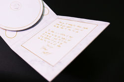
We planned to design the digipak with marble background replacing the reflective paper. Although the message that we waned to relay to the audience about Valentina Vow's song that would make them reflect on themselves and relfect on their love lives would dissapear along with the reflective paper design. But the marble background would match our target audience, high class teenager's taste as it is minimalistic and classy. These days many teenagers have been using marble iphone case and high-end shopping malls are decorated with marbles to make it classy. Therefore by applying the marble background instead of the reflective paper would solve the problem of their inability to print on reflective paper and also satisfy our customer's taste.
C P N
C H A P A N
 FINAL DESIGNImagine if the gradient grey is reflective paper. |
|---|
 Digipak DesignWe thought that this design is too plain, and does not look appealing enough for today's consumer who would prefer digital downloads over objects. Therefore we decided to change the design to make it more appealing so that people would want it as their prized possession. |
|---|
 Title on the bottom cornerWe tried adjusting the title onto the bottom corner. However it does not match with our website and the music video therefore we changed it to... |  title on the leftit is oddly placed making the frame a little awkward which represents the uncanny songs that would make your heart tremble as you can see yourself in every song. |
|---|
Our company's logo design is very simple it is inspired by Adele's label XL recordings. It is memorable and clean.
CHANGE
 |  |  |  |
|---|
PHOTOS
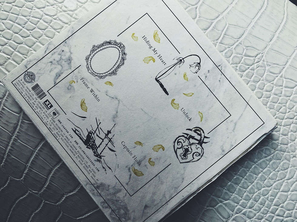
After we've assembled the digipak together along with taking photos of it, we decided to change the design because it is too minimalistic to encapsulate the rich meaning that we had in each of her songs. Therefore we planned to add more to it to create more meaning, however keeping the white marble and gold as those colours have meaning embedded to it and portrayed the star persona we wanted to create for Valentina.
 |  |  |  |
|---|
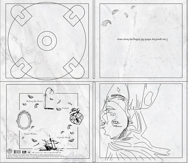
We have yet to finalize the digipak as we need to change the petals to gold and play around with the gold colour more to find the right balance therefore this is a work in process. We thought that Valentina's drawing on the front cover looks very weird and out of place therefore we planned to redo the drawing. The digipak panels were reduced to four as we wanted to keep all the panels rich with meaning yet simple and minimalistic therefore we resude it to four so we can play around with all the panels without making it too blank.

This is our first design which we deemed suitable for our first minimalistic design however it does not fit with our current digipak design.

Therefore we designed this new DVD, the marble patterns formed from pressure resembles the way Valentina grew up with her personal stories which inspires her to create songs. The marble pattern also enhances the album name 'inside' as it symbolises how pressure has led to her creating this album.

However when we printed out the album cover as well as the CD and put it together we found that the marble CD blends in too much with the digipak, and more importantly the album does not have the artist's name on it therefore as our artist is a singer-songwriter and the song is about her we decided to go with the white design as it stands out from the digipak as well as similar to the music video ending and the website.


BOX OR NO BOX
However when we printed out the album cover as well as the CD and put it together we found that the marble CD blends in too much with the digipak, and more importantly the album does not have the artist's name on it therefore as our artist is a singer-songwriter and the song is about her we decided to go with the white design as it stands out from the digipak as well as similar to the music video ending and the website.
We designed using boxes in each panel as we deemed it is representative of the title track, 'hiding my heart' as she has to stay strong and restraint her feelings to herself since she knows it is impossible for their love to continue. However we thought it was too messy and it looked incomplete, therefore we got rid of the box. Without the square outside the digipak looks much more cleaner and more minimalistic which is our aim. Therefore we chose to go with the one with no boxes, to create a product that fits with our target audeince of high class female teenager as well as the star persona we intended to carve for our artist which is mysterious yet youthful and innocent.


WHITE OR MARBLE?


We decided to go with the marble DVD as we deemed that it suites the digipak more. It gives a more gloomy vibe as well as obscure like the songs about her ambiguent heart. The white DVD stands out too much from the white marble digipak. After photoshopping in both to the same photo the difference is clearer therefore we choose to go with the white marble which encapsulates the meanings of her songs better than the white DVD.